Thursday, October 30, 2014

Blog 8


http://i.imgur.com/OrJunPB.png

These isoline maps represent the hours of sunshine each depicted area receives in a year. The amount of sunshine in a day plays an incredibly significant role in the emotion of the affected population. Growing up in southern California, I was able to play outside in the summer without the sun fully setting until 8:30 or 9 at night. It was awesome. On the other end of the spectrum, I have also lived in Ireland and it was dark by 6 (or 5 in the wintertime). The less sun there was, the less energized I felt. The more sunlight, the higher the inclination was to stay up and out of the house.

Sunday, October 26, 2014

Blog 7


http://go.owu.edu/~jbkrygie/krygier_html/geog_353/geog_353_lo/geog_353_lo11_gr/grad_cart.jpg

Check it out: This is a graduated circle map designed by a cartographer using a cartographic representation to show other cartographers the levels of cartography in each state.... That's cartographantastic!

Tuesday, October 21, 2014

Lab 6

Both versions of this map - whether it's on paper or the web - are beautiful. The biggest difference I saw after printing though was the glossiness the map obtained on the paper. This effect definitely made the lines and colors more vibrant than on the computer screen. Even though it is the same map, I find the printed version more pleasing to the eye.

Saturday, October 18, 2014

Blog 6


http://understandinggraphics.com/design/10-reasons-to-use-color/

The D.C. Metro system!! This is a map that has a very effective and recognizable color scheme. My most common trip is from Mason to Union Station (aka Vienna and switch over to Metro Centro and get off at Union Station). I have looked at this map so many times though that the trip is now just taking the Orange line to the Red line. Or, in high school I would get home by taking the Blue and switch over to the Orange.

Saturday, October 11, 2014

Blog 5

https://www.msu.edu/~dougl126/images/cancer_rates_jenks.jpg


It's a dark topic but look at the trend! The patterns in this choropleth map beg the viewer to ask the questions: 1. What factors have caused cancer to be concentrated in the northeast and on the west coast?  2. Why does the south have unanimously lower cancer rates than the rest of the U.S.?

Thursday, October 2, 2014

Week 4 blog

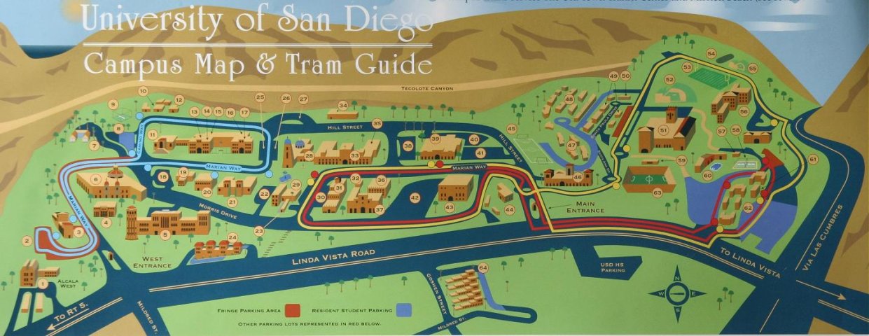
http://lindberglce.com/usd_bldg.htm


The USD campus map not only provides building locations for new students, but truly captures the personality of southern California. The brown/ green landscape, cloudless blue sky and ocean peeking in through the rolling hills are all aspects that definitely help the university become more appealing. It represents a great combination of art and information.

Lab 4