
Wednesday, December 10, 2014
Tuesday, November 18, 2014
blog 10

http://leistiar.wordpress.com/
Here is a bivariate map showing the relationship between state unemployment and suicide rates. The contrasting colors between choropleth and proportional symbols make it very easy to interpret trends and patterns in the data. The transparency of the proportional symbols also helps differentiate the state statistics. Last, the cartographer did a great job filling out the space on the page and organizing all of their information.

Tuesday, November 11, 2014
blog 9

This is a map showing the concentrations of different ethnicities living in London. Red represents white population, blue represents black population, hispanic is orange and green represents the Asian population. There is a great fill throughout the map as well as a great use of colors, but I still see two issues. First, the orange and red dots blend together a bit too much. Since the white population is so large, the orange dots get washed out. Second, the Asian population is larger than is depicted on the map. It may be the color or how closely the dots are placed, but the Asian population is a bit more dense in population than is shown.
http://www.protoraptor.com/2012/10/mapping-techniques-dot-density-mapping_3.html

Tuesday, November 4, 2014

Monday, November 3, 2014
Final Project Proposal
For my map, I am going to replicate my 2013 trip on the Camino de
Santiago Frances. For a month I walked from southern France to the west coast
of Spain over mountains and high plains, through sweltering days and freezing
nights, and traversed 500 miles of awe-inspiring land.
For centuries, Pilgrims
(peregrinos) have travelled from all over the world in the hopes of completing
the journey in the city of Santiago. As of late its popularity has increased,
with a record number of people on the Camino in 2013. Certain nationalities had
shot up since years prior, helping the numbers go from around 75,000 in 2003 to
over 300,000 ten years later. The presence of Americans and Canadians has increased
ten times over after the release of the movie “The Way” starring Martin Sheen
in 2010. Since the journey was such an
amazing adventure, I would like to map out what I experienced during my time on
the trail.

http://almentzer.files.wordpress.com/2013/06/camino-de-santiago.png?w=630&h=374
http://www.spain-holiday.com/blog/wp-content/uploads/2010/04/caminofrances3.gif
Even though there are countless maps on the topic, I cannot emphasize
enough that every pilgrim’s experience is unique. My goal with this map is to personalize
the pilgrimage and distinguish the physical attributes that stuck out in my
mind the most. I am hoping to get a base map of northern Spain and southern
France off of ArcGIS. The path of the Camino Frances can be found on the
Santiago- Compastella website. On top of the map, I would include the best
airport to fly into at the start, as well as 100 extra kilometers past the
traditional finish to what is known as the “End of the Earth” or Finisterre on
the Spanish coast. Also, since the landscape changed so drastically with each
region I walked through, my map design would include a depiction of the changing
physical landscapes along the way (i.e. mountains shifting to desert on the
map). Along with the background, I will include the path I took, towns/ cities I passed through, and the places
I slept. The audience is for anyone who would enjoy taking part in the Camino
experience. I can’t say enough good things about it, so this will be another opportunity
to speak highly of the trip while providing a cartographic design based on
personal experience.
Thursday, October 30, 2014
Blog 8

http://i.imgur.com/OrJunPB.png
These isoline maps represent the hours of sunshine each depicted area receives in a year. The amount of sunshine in a day plays an incredibly significant role in the emotion of the affected population. Growing up in southern California, I was able to play outside in the summer without the sun fully setting until 8:30 or 9 at night. It was awesome. On the other end of the spectrum, I have also lived in Ireland and it was dark by 6 (or 5 in the wintertime). The less sun there was, the less energized I felt. The more sunlight, the higher the inclination was to stay up and out of the house.
Tuesday, October 28, 2014

Sunday, October 26, 2014
Blog 7

http://go.owu.edu/~jbkrygie/krygier_html/geog_353/geog_353_lo/geog_353_lo11_gr/grad_cart.jpg
Check it out: This is a graduated circle map designed by a cartographer using a cartographic representation to show other cartographers the levels of cartography in each state.... That's cartographantastic!
Tuesday, October 21, 2014
Lab 6

Both versions of this map - whether it's on paper or the web - are beautiful. The biggest difference I saw after printing though was the glossiness the map obtained on the paper. This effect definitely made the lines and colors more vibrant than on the computer screen. Even though it is the same map, I find the printed version more pleasing to the eye.
Saturday, October 18, 2014
Blog 6
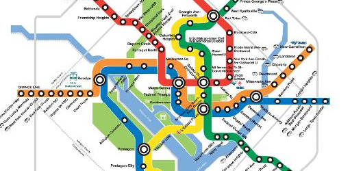
http://understandinggraphics.com/design/10-reasons-to-use-color/
The D.C. Metro system!! This is a map that has a very effective and recognizable color scheme. My most common trip is from Mason to Union Station (aka Vienna and switch over to Metro Centro and get off at Union Station). I have looked at this map so many times though that the trip is now just taking the Orange line to the Red line. Or, in high school I would get home by taking the Blue and switch over to the Orange.
Saturday, October 11, 2014
Blog 5
https://www.msu.edu/~dougl126/images/cancer_rates_jenks.jpg

It's a dark topic but look at the trend! The patterns in this choropleth map beg the viewer to ask the questions: 1. What factors have caused cancer to be concentrated in the northeast and on the west coast? 2. Why does the south have unanimously lower cancer rates than the rest of the U.S.?
It's a dark topic but look at the trend! The patterns in this choropleth map beg the viewer to ask the questions: 1. What factors have caused cancer to be concentrated in the northeast and on the west coast? 2. Why does the south have unanimously lower cancer rates than the rest of the U.S.?
Friday, October 10, 2014
.png)
.png)
Thursday, October 2, 2014
Week 4 blog
http://lindberglce.com/usd_bldg.htm
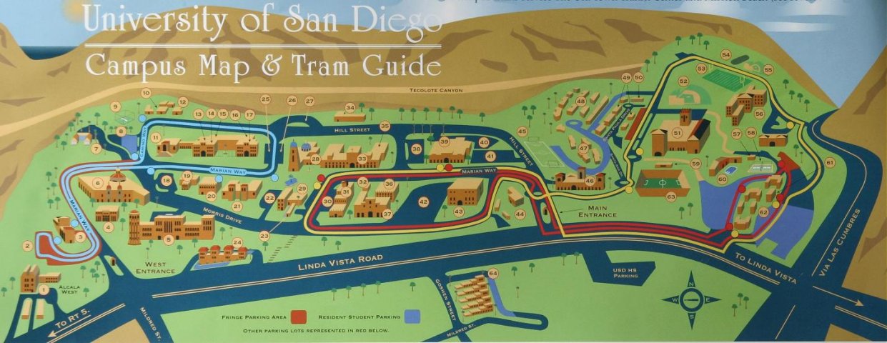
The USD campus map not only provides building locations for new students, but truly captures the personality of southern California. The brown/ green landscape, cloudless blue sky and ocean peeking in through the rolling hills are all aspects that definitely help the university become more appealing. It represents a great combination of art and information.
The USD campus map not only provides building locations for new students, but truly captures the personality of southern California. The brown/ green landscape, cloudless blue sky and ocean peeking in through the rolling hills are all aspects that definitely help the university become more appealing. It represents a great combination of art and information.

Thursday, September 25, 2014
.png)
Tuesday, September 23, 2014
Blog 3
http://www.wpmap.org/wp-content/uploads/2012/04/greece-map1.gif
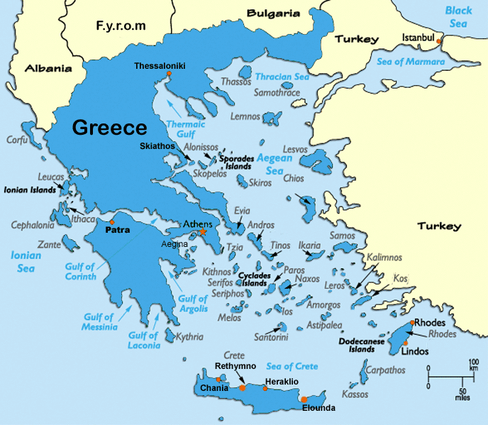
This map shows how text can create the focal point of a map. Even though Greece is one of the smaller countries in Europe, the large font size of the word "Greece" draws focus to the most important country on this particular map. The font size, shading and boldness of the surrounding Greek islands' names also raises the level of the Greece's visual significance in comparison to the other countries.
This map shows how text can create the focal point of a map. Even though Greece is one of the smaller countries in Europe, the large font size of the word "Greece" draws focus to the most important country on this particular map. The font size, shading and boldness of the surrounding Greek islands' names also raises the level of the Greece's visual significance in comparison to the other countries.
Week 2 blog
http://www.wired.com/images_blogs/wiredscience/2013/11/Lambert_conformal_conic_projection_SW.jpg

This Conformal Conic projection shows the Earth from an interesting perspective. Looking down from the north pole allows the viewer to see the amount of land that is concentrated exclusively in the northern hemisphere. It is crazy to think that 90 percent of the world's population is located in this limited space above the equator.
This Conformal Conic projection shows the Earth from an interesting perspective. Looking down from the north pole allows the viewer to see the amount of land that is concentrated exclusively in the northern hemisphere. It is crazy to think that 90 percent of the world's population is located in this limited space above the equator.
Thursday, September 18, 2014

Wednesday, September 10, 2014

Monday, September 8, 2014
Post 1: Static Map

This is a map depicting the path of Route 1 or "Pacific Coast Highway" in California. Growing up in Long Beach, my dad and I would take trips to different beaches along the southern part of the state. On the occasional Friday, he would pick me up from school -car packed- and we would head off for the weekend. On those trips, the travelling was as beautiful as the destination. For hours we would parallel the coast as his 1970 VW bug slowly twisted and turned down the old highway to San Onofre, San Clemente or even San Diego.
As a kid I travelled the same stretch of Route 1 from Long Beach to Mexico countless times. But if I make it back to California, it is my goal to drive from the top of the state all the way to the bottom. It would be the trip of a lifetime surrounded by beauty, beaches and nostalgia.
Subscribe to:
Posts (Atom)